Interactive-Web-Design-Elements-5

Interactive Web Elements in Web Design and Web Development

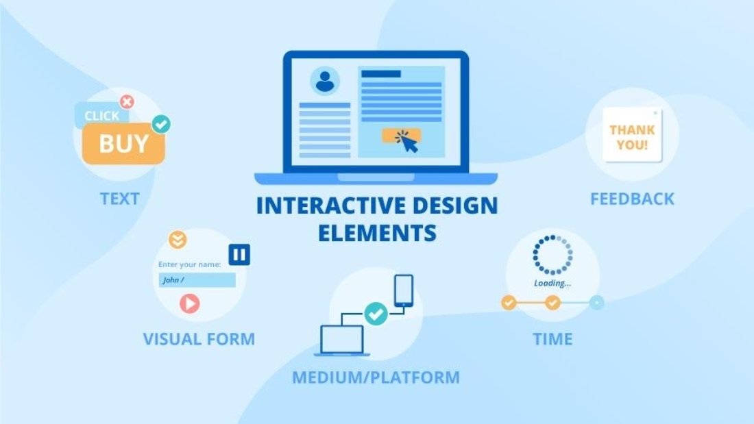
Integrating interactive online features has become a game-changer in the ever-evolving field of web design and development.
Interactive features are the lifeblood of contemporary websites, improving user engagement and raising the user experience overall.
Together, we will examine the importance of interactive web design and development and the various ways it is changing the digital landscape.

Introduction

As digital technologies continue to progress, static websites are increasingly becoming obsolete.
The demand for dynamic and engaging online experiences has given rise to the prominence of interactive web elements.
These elements not only capture the attention of visitors but also foster a sense of interactivity and immersion, making the web experience more memorable and enjoyable.

The Power of Interaction

Boosting User Engagement

Interactive elements serve as magnets for user engagement.
From captivating animations to user-friendly interfaces, these features invite visitors to explore and interact with the content.
As users actively participate in navigating through a site, the bounce rate diminishes, and the time spent on the website increases.
This heightened engagement translates into a more profound connection between the user and the brand.
By optimizing the interactive elements of a website, businesses can create an environment that is conducive to connection and engagement.
With the right tools, businesses can collect valuable data that will enable them to further understand their audience and improve their website.
This, in turn can lead to increased conversions and a better overall user experience.
Ultimately, interactive elements are essential for creating a successful and engaging website.

Seamless Navigation

Incorporating interactive navigation menus and buttons streamlines the user journey.
Intuitive design elements, such as hover effects and smooth transitions, contribute to a seamless navigation experience.
Users effortlessly glide through the website, finding what they need with minimal effort. This not only enhances user satisfaction but also encourages them to return.
Furthermore, interactive navigation helps create a more enjoyable user experience.
By dynamically responding to user input, interactive navigation can make users feel as if the website is alive and actively engaging with them.
Animations, sound effects, and other interactive elements can also be used to create an immersive environment that encourages users to explore and discover new content.
By adding interactive features to a website, designers can create a unique way to connect with users and make their experience more memorable.

Enhancing User Experience

Immersive Storytelling

Interactive elements enable websites to tell compelling stories.
Through parallax scrolling, interactive timelines, and multimedia integration, users are taken on a journey rather than a mere browsing session.
This immersive storytelling technique not only captivates the audience but also leaves a lasting impression, fostering a deeper connection with the brand.
The use of interactive elements allows websites to create a more engaging experience for their users.
With the help of custom animation, interactive menus, and forms, users are able to make meaningful connections with the content they’re viewing.
Not only do these elements help to create a more enjoyable browsing experience, but they also provide an opportunity for companies to educate their customers on their products and services.
By leveraging these interactive elements, companies can create a more impactful message that resonates with their audience.

Personalization Features

Tailoring the user experience is key to creating a lasting impact.
Interactive elements, such as personalized recommendation sliders and interactive quizzes, allow websites to cater to individual preferences.
By providing a personalized touch, websites can resonate more effectively with their target audience, leading to increased user satisfaction and loyalty.
User-generated content can further enhance the user experience.
By encouraging users to participate in the website, companies can create a dynamic community that will help to drive engagement, as well as create a sense of connectedness between the company and its users.
Additionally, user-generated content can provide valuable feedback to the company, helping to improve the user experience over time.

Implementation in Web Development

Responsive Design

The era of multi-device usage demands responsive web design.
Interactive elements play a pivotal role in adapting content seamlessly across various screen sizes.
Whether accessed on a desktop, tablet, or smartphone, websites with responsive interactive design maintain functionality and aesthetic appeal, ensuring a consistent and positive user experience.
This is especially important in today’s digital world, as mobile devices become more and more prevalent.
According to Statista, there are currently around 5.15 billion mobile phone users in the world, and this number is expected to continue to grow.
As such, responsive web design is no longer a luxury, but a necessity for companies looking to engage their customers online.
With the right interactive design, businesses can create an engaging and functional experience, regardless of platform.

Technological Advancements (H2 Heading)

The rapid evolution of web development technologies has paved the way for more sophisticated interactive elements.
From AI-driven chatbots to virtual reality integrations, websites now have the power to offer cutting-edge, interactive experiences.
Staying abreast of these advancements is crucial for web developers aiming to push the boundaries of innovation.
The development of these technologies also requires web developers to stay up-to-date with the latest coding standards and best practices.
This allows them to ensure that the code they write is optimized for performance and security. Furthermore, web developers must be cognizant of the potential compatibility issues that could arise when integrating these technologies into existing websites.
By keeping these things in mind, developers can create websites that provide users with a seamless, intuitive experience.

Future Trends and Considerations

Gamification

The gamification of web elements adds an element of fun and competitiveness.
From progress bars to achievement badges, integrating game-like features can transform a mundane website visit into an exciting journey.
As users engage with the site in a playful manner, brand recall and user satisfaction soar.
This makes gamification an important tool for website owners who want to increase customer engagement.
The addition of game-like elements can also lead to more time spent on the website, resulting in more opportunities for companies to showcase their products and services.
Furthermore, gamification can help businesses to create a sense of community among users, which can result in an increase in loyalty.
Ultimately, gamification can be a powerful way to increase website traffic, user engagement, and customer loyalty.

Accessibility

Inclusive design is paramount in today’s digital landscape.
When implementing interactive elements, web developers must prioritize accessibility.
Features such as alternative text for images, keyboard navigation, and compatibility with screen readers ensure that the interactive experience is enjoyed by all users, regardless of their abilities.
In addition, developers should employ design principles that consider the user’s context and environment.
This includes designing for different screen sizes, providing an interface that is responsive to a user’s device type, and ensuring that the content is optimized for the user’s network speed.
Developers should also strive to create a more intuitive user experience, which includes refining the user interface to reduce the amount of time and effort needed to complete a task.
Ultimately, the goal should be to create a website that is accessible and usable for everyone.

Conclusion

In the ever-evolving landscape of web design and development, the incorporation of interactive elements is no longer a luxury but a necessity.
From boosting user engagement to enhancing the overall user experience, these elements are the driving force behind successful and memorable websites.
As we look ahead, the fusion of creativity and technology will continue to shape the interactive web, offering endless possibilities for brands and users alike.

The-Ultimate-Guide-to-Ecommerce-Website-Development-in-2023

A Guide to E-commerce Website Development

A strong and easy-to-use e-commerce website is essential for success in the constantly changing world of digital commerce.

The creation of a successful e-commerce platform becomes strategically imperative as companies move their operations online.

The goal of this thorough guide is to help businesses make well-informed decisions to maximize their online presence by offering insights into the complexities of developing e-commerce websites.

Understanding the Basics of E-commerce

What is E-commerce?

E-commerce, also known as online buying and selling, happens through the internet.

It has revolutionized the way businesses operate, offering a global marketplace accessible to both consumers and businesses.

H2: The Importance of E-commerce in Today’s Market

In the digital age, consumers seek convenience, and e-commerce provides just that.

The ability to browse, compare, and purchase products online has become a fundamental aspect of modern consumer behavior.

Key Considerations in E-commerce Website Development:

Choosing the Right E-commerce Platform

Selecting the appropriate online business platform is a critical decision.

Platforms like Shopify, WooCommerce, and Magento each have unique features and cater to different business sizes and needs.

User Experience (UX) Design

A seamless user experience is paramount in e-commerce.

Intuitive navigation, clear product displays, and a streamlined checkout process contribute to positive user experiences, fostering customer satisfaction and loyalty.

Mobile Responsiveness

With the increasing use of smartphones, ensuring your e-commerce site is mobile-responsive is non-negotiable.

Google’s algorithms also prioritize mobile-friendly websites, impacting search rankings.

Security Measures

Building trust with your customers is crucial.

Implementing robust security measures, including SSL certificates and secure payment gateways, instills confidence in users, safeguarding their sensitive information.

SEO Integration

Optimizing your e-commerce site for search engines enhances visibility.

Keyword-rich product descriptions, alt text for images, and an SEO-friendly URL structure contribute to better search engine rankings.

Loading Speed Optimization

In the fast-paced online world, users expect instant gratification.

A website that takes a long time to load can result in a large number of visitors leaving the site immediately and increases bounce rates.

Compressing images, leveraging browser caching, and optimizing code are essential for swift page loading.

Advanced Features for E-commerce Excellence

Personalization and AI Integration

Tailoring the shopping experience through personalized recommendations based on user behavior can significantly enhance customer engagement.

Artificial Intelligence (AI) algorithms can analyze data to provide relevant product suggestions.

Advanced Analytics for Informed Decision-Making

Utilizing analytics tools helps track user behavior, assess marketing strategies, and refine business decisions.

Google Analytics and other tools provide valuable insights into website performance.

Integration with Social Media Platforms

Seamlessly connecting your e-commerce site with social media platforms amplifies your reach.

Social commerce is gaining momentum, with platforms like Instagram and Facebook offering direct shopping features.

Multi-channel Selling

Expanding beyond your website to sell on platforms like Amazon or eBay widens your customer base.

Integrating these channels into your e-commerce strategy enhances brand visibility.

Advanced Strategies for E-commerce Excellence

Streamlining Checkout for Maximum Conversions

A checkout process that is difficult to navigate may result in abandoned shopping carts.

Streamlining the checkout, providing multiple payment options, and integrating a guest checkout feature can significantly boost conversion rates.

Harnessing the Power of Customer Reviews

User-generated content, especially customer reviews, plays a pivotal role in building trust.

Encourage customers to leave reviews and showcase them strategically on your e-commerce site to influence potential buyers positively.

Implementing Progressive Web Apps (PWAs)

In the era of mobile browsing dominance, PWAs offer a hybrid between web and mobile applications. They provide faster load times and offline capabilities, enhancing the overall user experience on your e-commerce site.

Dynamic Pricing Strategies

Dynamic pricing, adjusting product prices based on demand, seasonality, or user behavior, can optimize sales. Implementing dynamic pricing algorithms ensures competitiveness and maximizes revenue.

Sustainable E-commerce Practices

Consumers are increasingly conscious of environmental impact.

Incorporating eco-friendly practices in your e-commerce business, such as sustainable packaging and green shipping options, can attract environmentally aware customers.

Overcoming E-commerce Challenges

Tackling Cart Abandonment

Cart abandonment is a common challenge in e-commerce.

Employ strategies like retargeting ads, personalized email campaigns, and offering incentives to entice customers back to complete their purchases.

Balancing Security and Convenience

Striking a balance between a secure transaction process and a convenient user experience is crucial.

Implement two-factor authentication and robust security measures without compromising on the ease of use.

International Expansion Considerations

Expanding globally requires considerations of cultural differences, varying regulations, and diverse payment methods.

Localizing your e-commerce site ensures a tailored experience for customers worldwide.

Staying Agile in a Rapidly Changing Landscape

The e-commerce landscape evolves swiftly.

Staying informed about emerging technologies, consumer trends, and industry innovations is vital to adapt and stay ahead of the competition.

Managing Inventory Effectively

Inventory management is key to preventing stockouts or overstock situations.

Implementing inventory management software and employing real-time tracking systems aids in maintaining optimal stock levels.

Implementing Cutting-Edge Technologies

Embracing Augmented Reality (AR) for Enhanced Product Visualization

Incorporating AR technology allows customers to virtually experience products before purchasing.

By immersing customers in the shopping experience, their confidence is boosted and the chances of returns are minimized.

Voice Search Optimization for E-commerce

With the rise of virtual assistants, optimizing your e-commerce site for voice search is crucial.

Implementing natural language keywords and conversational content aids in better visibility in voice search results.

Blockchain for Secure Transactions

Blockchain technology ensures transparent and secure transactions.

Integrating blockchain in payment processes adds an extra layer of security, building trust among customers concerned about online payment safety.

Subscription-Based Models for Recurring Revenue

Implementing subscription-based models offers a steady stream of revenue.

Providing subscription options for products or services creates a loyal customer base and ensures predictable income for your e-commerce business.

Chatbots for Enhanced Customer Support

Integrating chatbots in your e-commerce site provides immediate assistance to customers.

These AI-powered tools can handle frequently asked questions, guide users through the purchase process, and enhance overall customer satisfaction.

Enhancing Marketing Strategies

Influencer Marketing in E-commerce

Utilizing influencers to endorse your products can greatly broaden your audience.

Partnering with influencers relevant to your industry can create authentic connections with your target audience.

Email Marketing Automation

Utilizing email marketing automation tools streamlines communication with customers.

Sending personalized emails, abandoned cart reminders, and targeted promotions enhances customer engagement and boosts sales.

Social Proof and User-Generated Content

Displaying social proof, such as testimonials and user-generated content, builds credibility.

Encouraging customers to share their experiences on social media can create a community around your brand.

Retargeting Strategies for Conversion Optimization

Implementing retargeting ads keeps your brand in front of potential customers who visited your site but didn’t make a purchase. This strategic approach can lead to increased conversions and sales.

Data-Driven Personalization

Utilizing customer data for personalized marketing creates a tailored shopping experience.

Recommendations based on past purchases, browsing behavior, and demographics can significantly increase conversion rates.

Conclusion

E-commerce website development is a multifaceted process that requires meticulous planning and execution.

By prioritizing user experience, incorporating advanced features, and staying abreast of industry trends, businesses can position themselves for success in the competitive online marketplace.

Remember, the journey doesn’t end with the launch – continuous optimization and adaptation are keys to sustained success.

10138d169bff0855d369a0b39fe4bf28615f7a97-1200x800

Mastering Color Theory in Web Design

A Brief Look Into Color History

Color has been an important part of human history and culture for centuries.

From ancient civilizations to modern times, color has been used to express emotions, convey messages, and create visual impact.

In ancient Egypt, for example, certain colors were associated with specific gods and had symbolic meanings.

In the Middle Ages, color pigments were highly valued and used to create intricate illuminated manuscripts.

The invention of synthetic colors in the 19th century revolutionized the world of art and design, allowing for a wider range of vibrant and long-lasting colors.

Understanding the historical significance of color can provide designers with a deeper appreciation for its role in web design and inspire them to explore new color palettes and combinations.

What is color theory in website design?

Color theory is the study of how colors interact with each other and how they can be used to create specific effects.

It encompasses concepts such as color harmonycolor psychology, and color symbolism.

One fundamental concept in color theory is the color wheel, which consists of primary, secondary, and tertiary colors.

Primary colors, including red, blue, and yellow, cannot be created by mixing other colors and are used as the foundation for all other colors.

Secondary colors, such as orange, green, and purple, are created by mixing two primary colors.

Tertiary colors, like red-orange or yellow-green, are created by mixing a primary color with a secondary color.

By understanding the color wheel and color relationships, designers can create visually balanced and aesthetically pleasing color palettes.

Understanding Color Psychology

Color psychology explores the psychological and emotional effects of different colors.

Colors can evoke specific emotions and influence how people perceive and interact with a website.

For example, red is often associated with passion and excitement, while blue is associated with trust and reliability.

Yellow can evoke feelings of happiness and optimism, while green is often associated with nature and tranquility.

Understanding the psychological impact of colors can help designers create websites that effectively communicate the desired message and evoke the intended emotional response.

It’s important to note that color psychology can vary across different cultures and individuals, so designers should consider the target audience and cultural context when using colors in web design.

Creating Visual Hierarchy with Color

Color can be used to create visual hierarchy and guide users’ attention to important elements on a webpage.

By using contrasting colors, designers can make certain elements stand out and draw the user’s eye.

For example, using a bold and vibrant color for a call-to-action button can make it more noticeable and encourage users to take action.

On the other hand, using a muted color for less important elements can help maintain visual balance and prevent overwhelming the user.

In addition to color, other design principles such as size, typography, and spacing also contribute to creating an effective visual hierarchy.

By combining these elements strategically, designers can guide users through the content and improve the overall user experience.

The Fundamentals of Color Theory

Color theory is the study of how colors interact with each other and how they can be used to create specific effects.

It encompasses concepts such as color harmony, color psychology, and color symbolism.

One fundamental concept in color theory is the color wheel, which consists of primary, secondary, and tertiary colors.

Primary colors, including red, blue, and yellow, cannot be created by mixing other colors and are used as the foundation for all other colors.

Secondary colors, such as orange, green, and purple, are created by mixing two primary colors.

Tertiary colors, like red-orange or yellow-green, are created by mixing a primary color with a secondary color.

By understanding the color wheel and color relationships, designers can create visually balanced and aesthetically pleasing color palettes.

Choosing the Right Color Palette

Choosing the right color palette is essential for creating a visually appealing and cohesive web design.

A well-chosen color palette can evoke specific emotions, convey the brand’s personality, and improve user experience.

When selecting a color palette, designers should consider factors such as the brand’s identity, target audience, and the intended mood or atmosphere of the website.

Warm colors like red and orange can create a sense of energy and excitement, while cool colors like blue and green can evoke calmness and tranquility.

Neutral colors like gray and beige can provide a sense of simplicity and elegance.

It’s also important to consider color contrast and accessibility when choosing a color palette.

High contrast between text and background colors ensures readability, especially for users with visual impairments.

Using color contrast tools and considering accessibility guidelines can help designers create inclusive and user-friendly websites.

Color Wheel

The color wheel is a visual representation of how colors relate to each other. It consists of primary, secondary, and tertiary colors arranged in a circular format.

The color wheel helps designers understand color relationships and create harmonious color schemes.

By using colors that are adjacent to each other on the color wheel, designers can create a sense of unity and harmony.

On the other hand, using colors that are opposite each other on the color wheel can create a strong contrast and add visual interest to a design.

Exploring the color wheel and experimenting with different color combinations can help designers create unique and visually appealing web designs.

Color Relationships

Color relationships play a crucial role in web design.

Understanding how different colors interact with each other can help create harmonious and visually appealing websites.

By considering color relationships, designers can choose colors that complement each other and create a cohesive design.

One important color relationship is complementary colors, which are opposite each other on the color wheel.

These colors create a strong contrast and can be used to draw attention to specific elements on a webpage.

Analogous colors, on the other hand, are adjacent to each other on the color wheel and create a more subtle and harmonious effect.

Exploring different color relationships and experimenting with various combinations can help designers create unique and eye-catching web designs.

Optimizing Color Contrast for Accessibility

Optimizing color contrast is crucial for ensuring that a website is accessible to all users, including those with visual impairments or color blindness.

A high level of color contrast between text and background colors improves readability and usability.

Designers should consider using dark text on a light background or light text on a dark background to ensure sufficient contrast.

There are various color contrast tools available that can help designers evaluate and adjust the color contrast of their designs.

Following accessibility guidelines and considering the needs of all users can result in a more inclusive and user-friendly web design.

Good-website-design (1)

What is a Good Website Design?

In the digital realm, a company’s website serves as its front entrance. When someone wants to know more about a firm, they look at it first.

A well-designed website may attract visitors, capture their interest, and eventually convert them into paying clients.

However, what precisely constitutes a decent website design?

The main components of a well-designed website will be discussed in this article, along with how they may help your online presence succeed.

User-Friendly Navigation

Clear Menu Structure

A critical element in creating a successful website design is having navigation that is easy for users to navigate.

A website should have a clear and intuitive menu structure that allows visitors to easily find what they are looking for.

The menu should be organized logically, with main categories and subcategories if necessary.

Intuitive Navigation Bar

In addition to a clear menu structure, a good website design should also include an intuitive navigation bar.

The navigation bar should be prominently displayed at the top of the page and should include links to the most important sections of the website.

Easy-to-Find Search Bar Another important element of user-friendly navigation is an easy-to-find search bar.

This allows visitors to quickly search for specific content or products without having to navigate through multiple pages.

Responsive Design

Mobile Compatibility

In today’s mobile-first world, it is essential for a website to be responsive.

This means that the website should be able to adapt to different screen sizes and devices, including smartphones, tablets, and desktop computers.

Fast Loading Times

In addition to being responsive, a good website design should also have fast loading times.

Visitors are less likely to stay on a website that takes a long time to load, so it is important to optimize your website’s performance.

Cross-Browser Compatibility

A good website design should also be compatible with different web browsers, including ChromeFirefoxSafari, and Edge.

This ensures that your website looks and functions correctly regardless of the browser used by the visitor.

Visual Appeal

Clean and Modern Design

The visual appeal of a website is also important.

A good website design should have a clean and modern look that is visually appealing to visitors.

This includes using high-quality images, videos, and graphics to enhance the overall aesthetic of the website.

Consistent Branding

Another important aspect of visual appeal is consistent branding.

A good website design should reflect your brand identity and convey a cohesive message to visitors.

Readability

In addition to visual appeal, a good website design should also prioritize readability.

This involves the utilization of readable typefaces, suitable font dimensions, and ample distinction between text and background hues.

Engaging Content

Relevant and Informative Content

Captivating and compelling content serves as the linchpin to retaining visitors on your website, ensuring their continued engagement and exploration.

Scrupulously ensure that your content not only aligns with the interests of your target audience but also resonates deeply with their needs and aspirations.

Multimedia Content

In addition to text-based content, a good website design should also include multimedia content such as images, videos, and infographics.

This can help to engage visitors and make your website more visually appealing.

Call-to-Action (CTA) Buttons

Finally, a good website design should include clear and compelling call-to-action (CTA) buttons.

These buttons encourage visitors to take a specific action, such as signing up for a newsletter, requesting a quote, or making a purchase.

Conclusion

In conclusion, a good website design is essential for attracting and retaining visitors.

By focusing on user-friendly navigation, responsive design, visual appeal, and engaging content, you can create a website that effectively communicates your brand message and converts visitors into customers.

How-to-Optimize-Images-for-WordPress-1024x559

Optimizing Images for WordPress

Boosting Performance and Enhancing User Experience

Optimizing each component of your WordPress website is essential in the ever-changing field of web development.

WordPress image optimization is a sometimes disregarded but significant component.

We’ll explore the why and how of WordPress image optimization in this post to make sure your website looks fantastic and functions at its peak.

Overview
First impressions are crucial when it comes to creating an online presence.

Potential visitors may be turned off by pages that load slowly because of poorly optimized images.

Thankfully, optimizing photos is a simple procedure that may greatly enhance the speed and usability of your website.

You can profit from a website that loads more quickly once you have optimized your photos.

Visitors frequently abandon websites that take too long to load images because they dislike waiting for them to do so.

Your website’s ranking in search engine results can be raised by optimizing it to load swiftly and efficiently.

Additionally, your website will be more accessible to mobile users, as optimized images are more efficient and can make pages load faster on mobile devices.

Understanding Image Optimization

Why Image Optimization Matters

In the digital realm, speed is paramount.

Search engines favor faster websites, and users expect quick access to information.

Optimizing images reduces file sizes, resulting in faster load times, which, in turn, positively impacts your site’s search engine rankings.

Additionally, optimized images enable faster page-load speeds, which is especially important for mobile users.

Slow-loading webpages can be particularly frustrating on mobile devices, as users may be on a slower connection or have limited bandwidth.

Optimized images can make a world of difference in page loading speeds, providing a better user experience.

Finally, properly optimized images can reduce hosting costs.

Smaller image sizes mean fewer resources used when loading the page, leading to lower hosting costs.

The Impact on User Experience

A website’s user experience (UX) has a major impact on its success.

Images that load slowly might irritate users and increase bounce rates.

A smooth and delightful user experience is guaranteed by optimized photos, which also promote interaction and entice users to explore your website further.

Optimized photos also contribute to faster websites.

Faster websites typically rank better in search engine results pages, making site speed a key component of SEO success.

This can enhance the user experience overall and increase organic traffic to your website.

In the end, image optimization can improve the performance of your website.

The Process of Image Optimization

1. Choosing the Right File Format

JPEG vs. PNG vs. GIF

Selecting the appropriate file format is the first step in optimization.

JPEG is ideal for photographs, PNG for graphics with transparency, and GIF for simple graphics and animations.

Understanding these distinctions ensures optimal image quality and performance.

The JPEG format is best for photographs and detailed images, as its compression algorithm removes unnecessary data and reduces file size.

This makes it an ideal choice for the majority of web applications.

PNG is a great choice for images with transparency, as it supports alpha channels.

This makes it great for logos, icons, and other graphics.

Lastly, GIF is perfect for simple animations and graphics, as its file size is usually significantly smaller than PNG or JPEG.

It is also the only format that supports animation.

2. Compression Techniques

Lossless vs. Lossy Compression

It is essential to find the proper equilibrium between image quality and file size.

Lossless compression maintains high quality but might not reduce file size significantly.

On the other hand, lossy compression achieves more substantial reductions but may slightly compromise image quality.

Finding the right balance is key.

This is why many image editing programs offer options for both lossless and lossy compression.

Through experimentation, users can determine which type of compression works best for their particular image.

When lossy compression is used, it’s important to save a copy of the original image with no compression so that the original can be referenced if needed.

3. Image Dimensions and Scaling

Resizing for Responsiveness

Ensure images are appropriately sized for their placement on the website.

Scaling down large images using HTML or CSS directly might seem convenient, but it’s not efficient.

Resizing images before uploading ensures better performance and a more responsive design.

Additionally, use an image editor to compress image files to reduce file size without sacrificing quality.

Ensure that images are correctly sized to avoid issues like distorted or stretched images.

When dealing with mobile devices, it’s important to use responsive images that scale correctly to fit their corresponding screens, and in some cases, use different images on different devices.

4. Leveraging WordPress Plugins

Top Image Optimization Plugins

There are a plethora of high-quality, industry-leading plugins available for use with WordPress designed to simplify the process of image optimization.

Popular choices like SmushEWWW Image Optimizer, and ShortPixel automate the process, making it user-friendly even for those without extensive technical knowledge.

Smush is particularly useful as it features an inbuilt bulk image optimizer that processes multiple photos at once.

Not only does this save time, but it also reduces the strain on servers as images are compressed, reducing the size of the page and improving loading times.

ShortPixel offers similar features, but it also provides advanced options such as WebP conversion and lazy loading, which can help further improve your site’s performance.

Best Practices for Image SEO

1. Descriptive Filenames and Alt Text

Enhancing Accessibility and SEO

Assign meaningful filenames and alt text to your images.

This not only improves accessibility for users with disabilities but also provides search engines with valuable information, contributing to better SEO rankings.

Image Size and Dimensions Compress and Resize Images for Performance Search engines factor in page speed when ranking websites.

2. Utilizing Image Sitemaps

Guiding Search Engines

Include images in your XML sitemap to ensure search engines index them accurately.

This enhances your website’s visibility in image search results, potentially attracting a broader audience.

Image tags are also beneficial to SEO.

Including descriptive alt tags in your images allows search engines to better understand what’s in the image.

This can help boost your SEO ranking and further enhance your visibility in search engine results.

Furthermore, using descriptive filenames can also help search engines understand the images and their relevance to your page.

Conclusion

Optimizing images for your WordPress website is not just a technical necessity; it’s a strategic move to elevate your online presence.

By adopting these practices, you not only enhance performance and user experience but also position your site favorably in the competitive digital landscape.

Incorporating image optimization into your web development strategy pays dividends in terms of improved site speed, higher search engine rankings, and increased user satisfaction.

Embrace these techniques, and watch your WordPress website thrive.